| Concept | Description |
|---|---|
| Layout | |
| Ribbon Layout | Home, Insert, Modeling, View, and Help tabs of the ribbon |
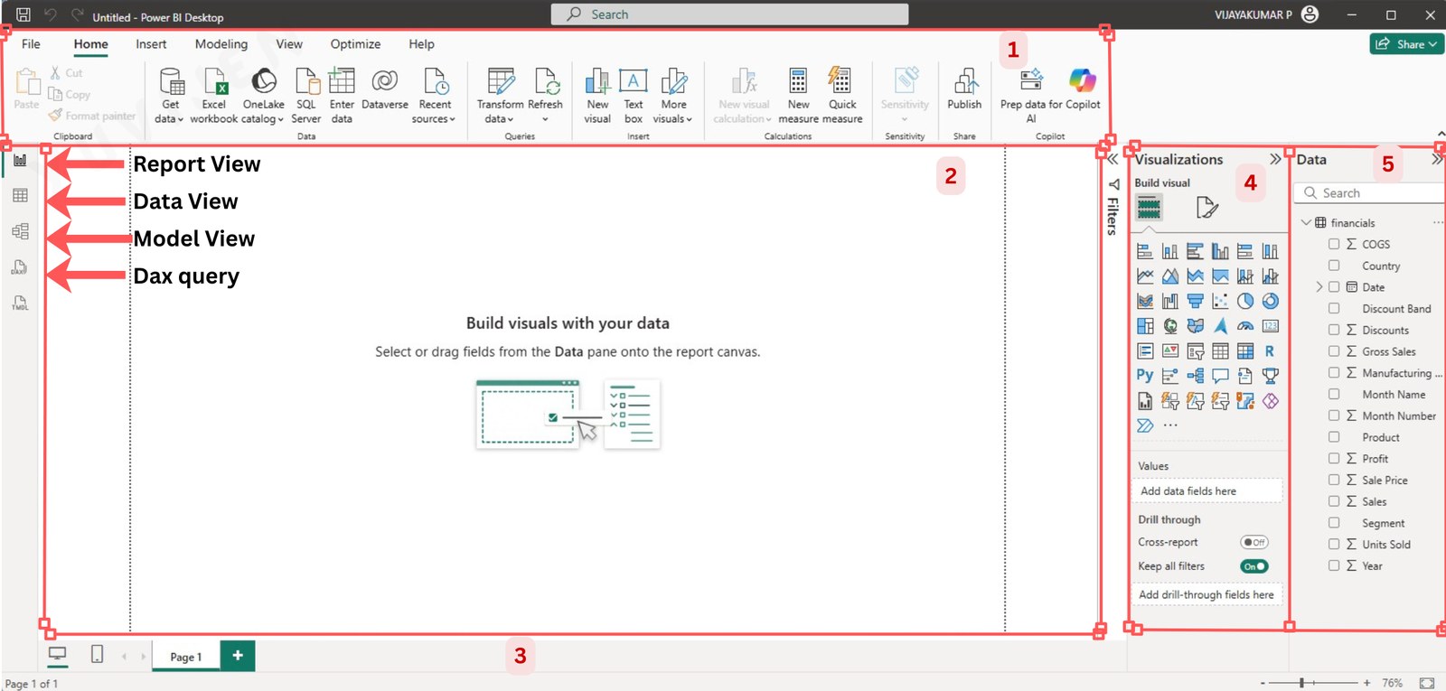
| Report View | Canvas where pages, visuals, and interactivity are designed |
| Data View | Tabular preview of imported tables and their data |
| Model View | Diagram of tables, relationships, and hidden fields |
| Authoring Panes | |
| Visualisations Pane | Library of visualisations and formatting options |
| Fields Pane | Tables and columns dragged onto visuals to populate values |
| Filters Pane | Visual-, page-, and report-level filters |
| View Options | Page view, mobile layout, and theme controls |
4 Working with the Power BI Interface
Power BI provides an intuitive and user-friendly interface designed to help users seamlessly create reports, analyze data, and generate insights. Understanding its interface is essential for effectively using Power BI for data visualization and business intelligence.
4.1 Launch Power BI Desktop
Go to the Start Menu and search for Power BI Desktop.
Click on the application to open it.
Upon launching, the Welcome Screen appears, providing options to start a new report 👇
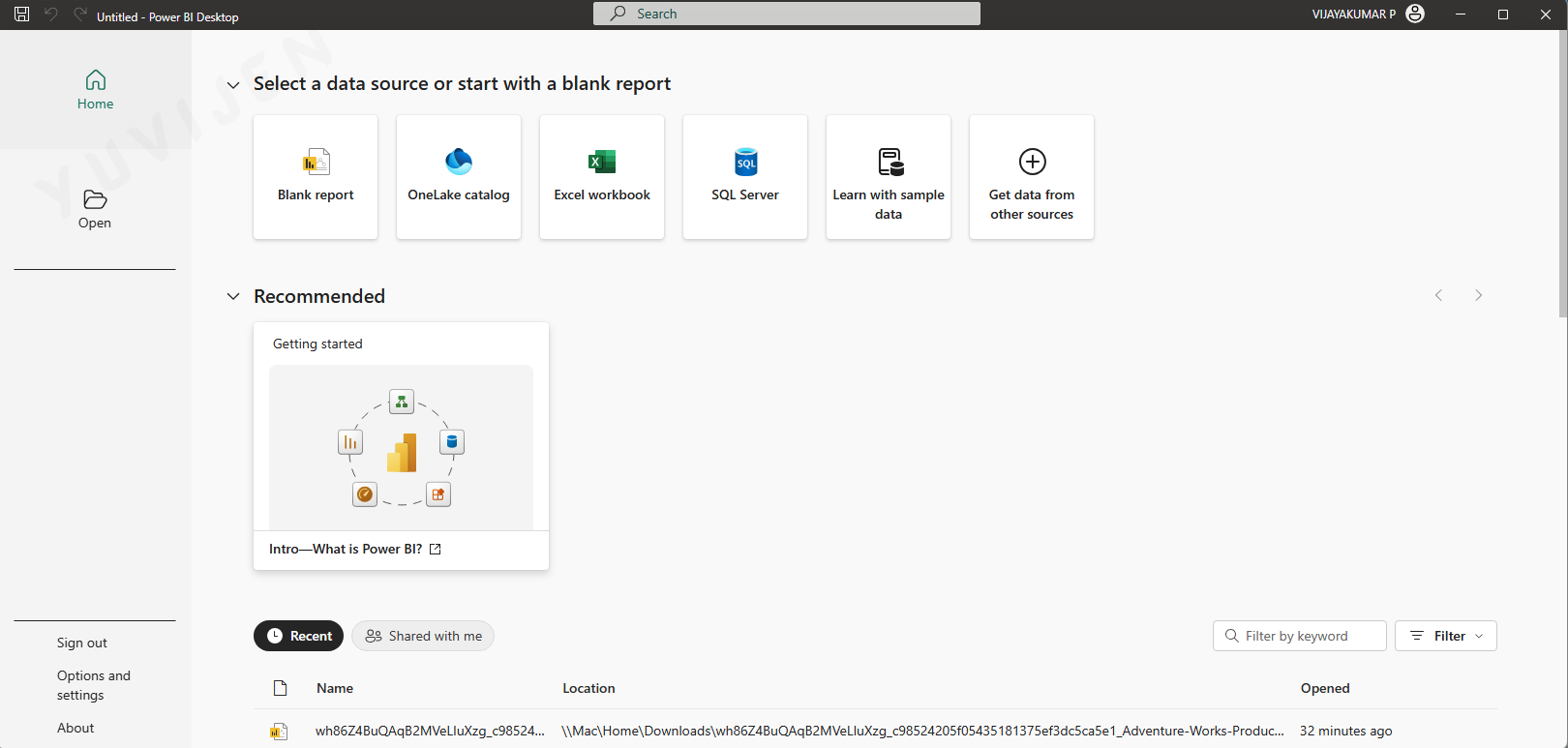
open an existing file, or
select Learn with sample data to load a sample data to the power bi desktop.
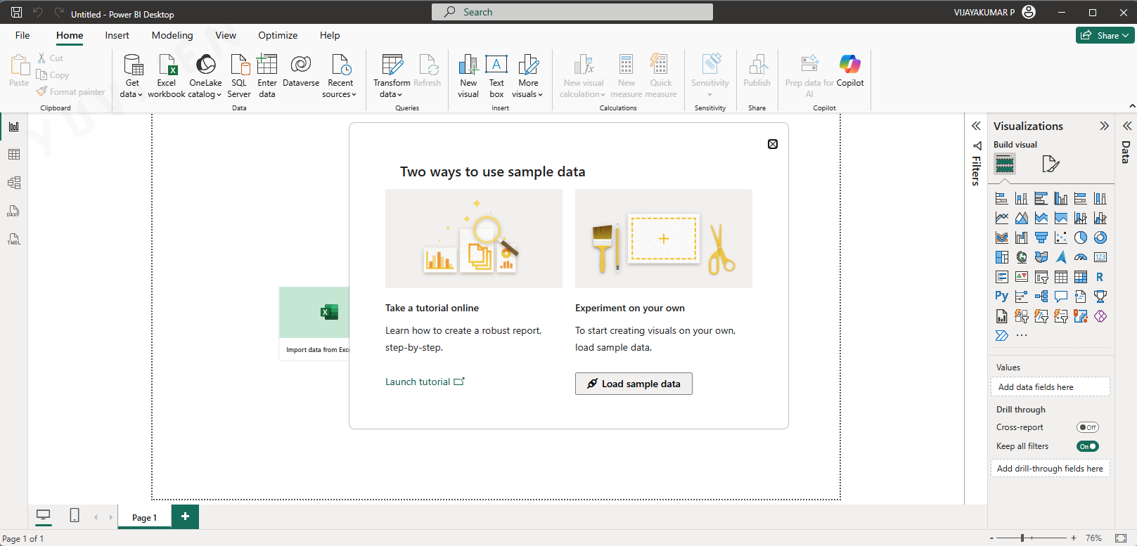
- Click Load sample data
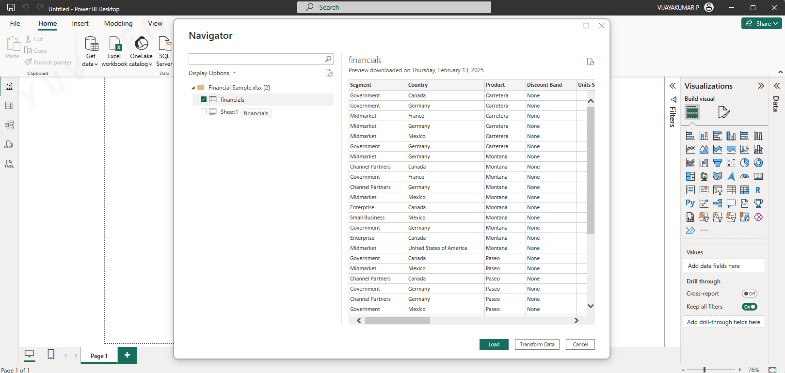
- Check the ✅ Financials in the Navigartor window and click on Load.
4.2 Main Interface Components
Understanding the Power BI environment is essential for creating effective reports and dashboards. Below are the key components of the Power BI interface:
4.3 Power BI Interface Components
Ribbon
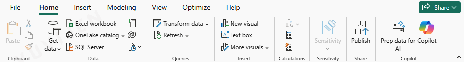
The Ribbon contains various tabs and commands, similar to Microsoft Office applications. The main tabs include:
- Home Tab: Provides options to import data, transform data, manage queries, create visuals, and publish reports.
- Insert Tab: Allows users to add visuals, text boxes, buttons, and images to the report.
- Modeling Tab: Used for creating relationships between tables, managing calculated columns, and defining DAX measures.
- View Tab: Adjust the report layout, themes, and mobile view settings.
- Help Tab: Provides links to documentation, support, and Power BI community resources.
Pages

The Pages Tab is located at the bottom of the canvas.
- The report view consists of multiple pages (similar to slides in PowerPoint), allowing users to create structured reports.
- Use it to select, add, or manage report pages.
- Each page can contain a unique set of visualizations, allowing for organized and structured reports.
Visualization
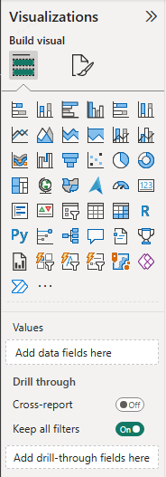
The Visualizations Pane provides a collection of visualization options, allowing users to:
- Select different chart types (bar charts, pie charts, line charts, etc.).
- Apply formatting options such as colors, labels, and data sorting.
- Add filters and slicers to control the data displayed in the report.
Functions include:
- Applying filters.
- Dragging fields to create visuals.
- Altering colors, axes, and chart types.
Filters Pane (Right Sidebar)
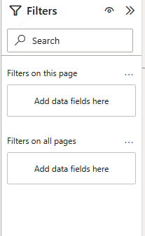
The Filters Pane allows users to apply filters at three levels:
- Visual-Level Filters: Affect only the selected visual.
- Page-Level Filters: Apply filters to all visuals on the current page.
- Report-Level Filters: Apply filters to all pages in the report.
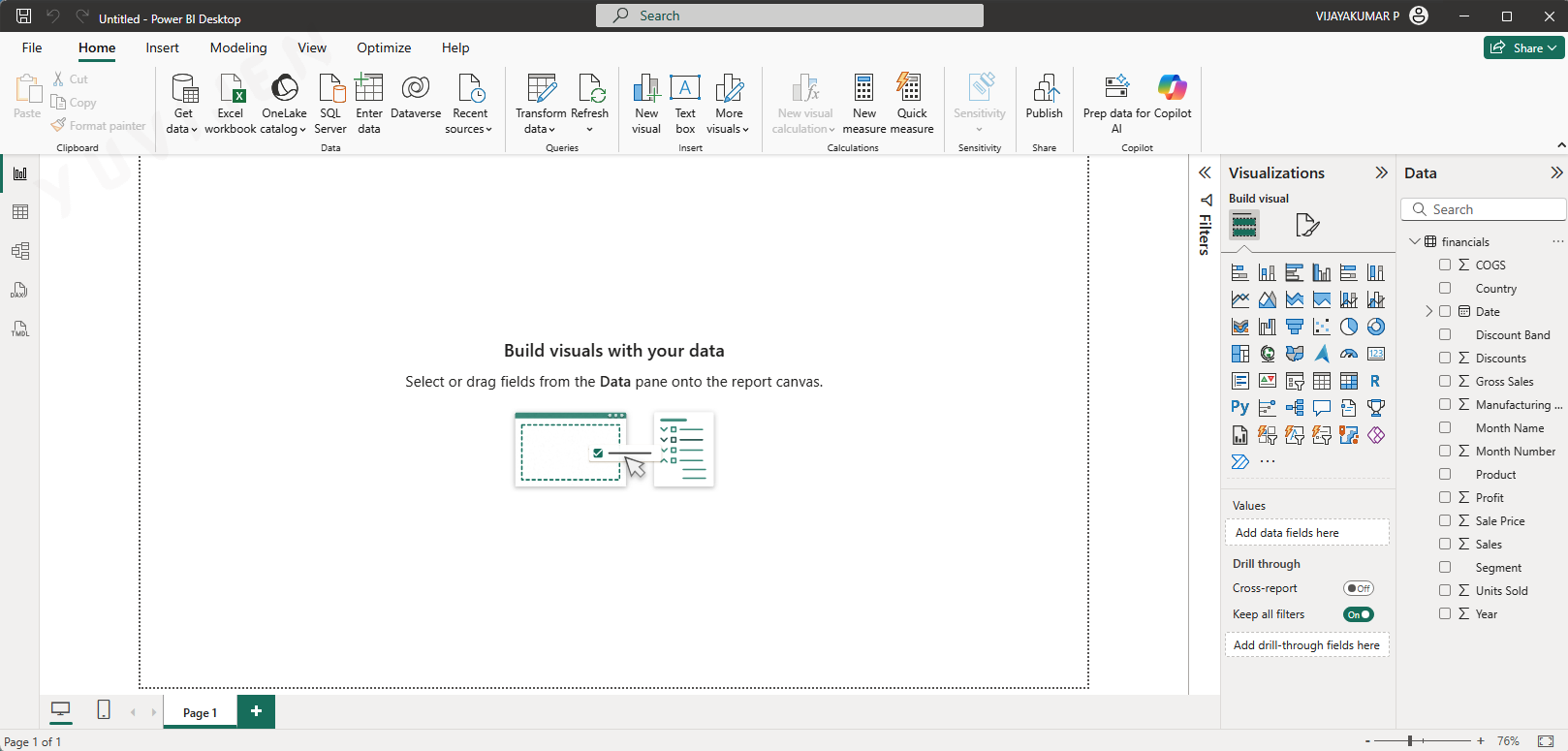
Data Pane
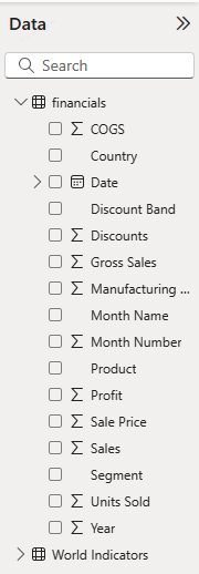
The Data Pane displays the datasets, tables, and fields available for visualization.
- Users can expand tables to view individual fields.
- Dragging fields from this pane onto the report canvas creates visualizations.
Once a report is created, users can:
- Click Save to store the file as a
.pbixfile for future editing. - Click Publish to share the report on Power BI Service (requires a Microsoft Power BI account).
4.4 Power BI Views
Power BI Desktop provides five dedicated views accessible from the left navigation pane, each serving a distinct purpose in the report and model development workflow.
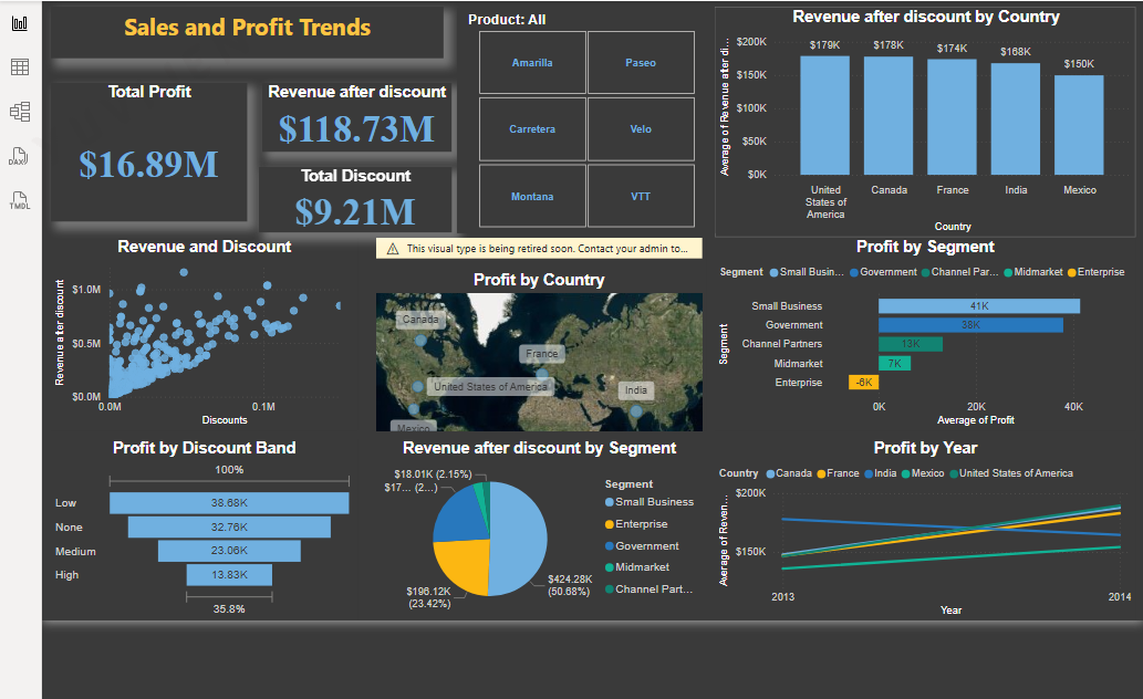
The Report View is the default view that opens when you launch Power BI Desktop and load data. It is the main canvas where you design, build, and interact with your reports. The canvas is a blank workspace onto which you drag fields from the Data pane to create visualizations such as bar charts, line charts, maps, tables, and cards. Each report can contain multiple pages, and you navigate between them using the page tabs at the bottom of the canvas.
Within Report View, the left navigation pane provides icons that let you switch between the five views available in Power BI Desktop: Report View, Table View, Model View, DAX Query View, and TMDL View. In Report View itself, visuals placed on the canvas are interactive — clicking a bar in a chart cross-highlights related visuals on the same page, and slicers filter all visuals simultaneously. You can also use the Visualizations pane on the right to switch a visual’s chart type, configure its fields (Axis, Values, Legend), and apply formatting such as colors, titles, and data labels. The Filters pane alongside it lets you apply filters at the visual level, the page level, or across the entire report. Report View is where the majority of report-building work takes place, and everything visible to end users in the published report is created here.
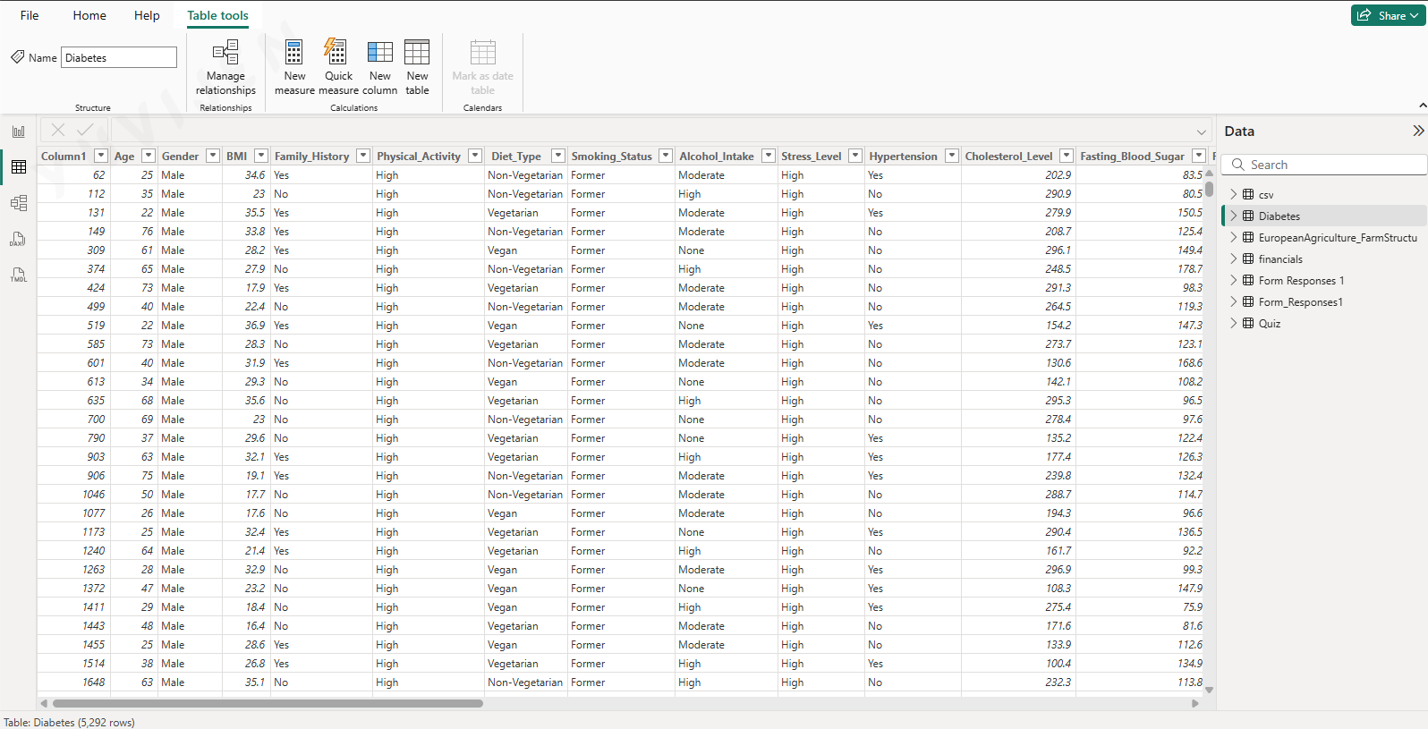
The Table View (previously called Data View in older versions of Power BI Desktop) shows the actual data loaded into your model in a row-and-column grid format, similar to a spreadsheet. You access it by clicking the table icon in the left navigation pane. Each table in your model appears as a separate selectable table in the Fields pane on the right, and clicking a table displays its rows and columns in the grid.
Table View is where you inspect the contents of your data after it has been loaded and transformed. You can verify that column values look correct, check that data types have been assigned properly (text, whole number, decimal, date, and so on), and confirm that transformations applied in Power Query Editor produced the expected results. The column headers display the data type icon alongside the column name, making it easy to spot misclassified columns.
A key capability of Table View is adding calculated columns using DAX. When you right-click a table or click New column in the Table tools ribbon that appears at the top, Power BI adds a new column and opens the formula bar where you type a DAX expression. The calculated column is evaluated row by row across the table and its values appear immediately in the grid. This is distinct from measures, which are calculated dynamically at query time. Table View also provides the Column tools ribbon, which allows you to set the data type, change the display format, configure summarization behaviour, and apply sort-by-column settings — for example, sorting a MonthName column by its MonthNumber column so that months appear in calendar order in visuals.
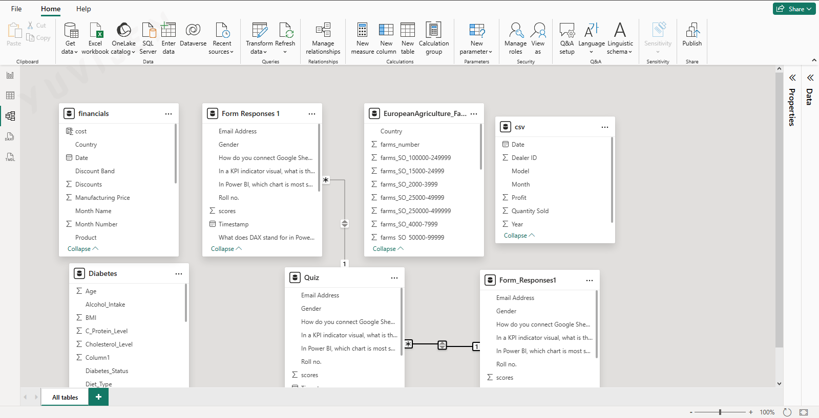
The Model View provides a visual diagram of all the tables in your data model and the relationships between them. You access it by clicking the model (relationship) icon in the left navigation pane. Each table appears as a card showing its column names, and relationship lines connect related tables with annotations indicating the cardinality and cross-filter direction of each relationship.
Relationships in Power BI define how tables are joined when visuals request data from multiple tables. A relationship line with a 1 on one end and an asterisk (*) on the other represents a one-to-many relationship, which is the most common type — for example, one row in a Date table matching many rows in a Sales table. Many-to-many relationships are also supported and are indicated with asterisks on both ends. The arrow on a relationship line shows the cross-filter direction: a single arrow means filtering flows in one direction only, while a double arrow means filtering flows both ways.
To create a new relationship, you drag a column from one table and drop it onto the matching column in another table. Power BI opens the Edit Relationship dialog where you can confirm the columns being joined, set the cardinality, and choose the cross-filter direction. You can also edit or delete existing relationships by double-clicking their connecting line. In Model View you can additionally hide columns from report authors by right-clicking a column and selecting Hide — hidden columns remain available for use in DAX expressions but do not appear in the Fields pane, keeping the interface clean for report builders. Organising tables into display folders is also done here, grouping related measures and columns so that the Fields pane is easier to navigate in large models.
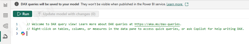
The DAX Query View was introduced in Power BI Desktop to give analysts and developers a dedicated environment for writing, executing, and testing DAX queries directly against the loaded model. You access it by clicking the DAX query icon in the left navigation pane. The view presents a query editor panel on the left and a results pane on the right that displays the output of executed queries.
Unlike DAX measures, which are evaluated implicitly when used in a visual, DAX queries use an explicit EVALUATE statement to return a table of results. For example, writing EVALUATE Sales returns all rows from the Sales table, while EVALUATE SUMMARIZECOLUMNS(Sales[Region], "Total Sales", SUM(Sales[Amount])) returns a grouped summary. You run a query by pressing the Run button or using the keyboard shortcut, and the results appear immediately in the results pane. This makes DAX Query View extremely useful for verifying that a measure calculates correctly, exploring what a DAX function returns, and debugging complex expressions before embedding them in visuals.
A practical shortcut is the right-click context menu available on any table, column, or measure in the Data pane: selecting “Define and evaluate” or “Evaluate” generates and runs a starter DAX query for that object automatically, saving you from writing the query from scratch. Queries written in this view are session-only — they are not saved as part of the .pbix file in a way that affects the published report, and they do not appear when the report is opened in Power BI Service. This makes the view a safe workspace for exploration and testing without any risk of altering the report itself.
[Insert screenshot of the TMDL View showing the semantic model definition in Tabular Model Definition Language syntax, with table definitions, column properties, and measure expressions visible in the code editor panel]
The TMDL View (Tabular Model Definition Language View) is a newer addition to Power BI Desktop that exposes the full definition of your semantic model as structured, human-readable text. You access it by clicking the TMDL icon in the left navigation pane. The view presents the model’s tables, columns, measures, relationships, and other properties as TMDL code — a structured text format developed by Microsoft specifically for defining tabular models.
TMDL represents each object in the model in a clean, indented syntax. A table definition includes its source query, all column names and data types, and any measures defined within it. Relationships are described with their from-table, to-table, cardinality, and cross-filter direction. This makes TMDL View a powerful tool for reviewing the complete structure of a model at a glance, in a way that the visual diagrams of Model View cannot convey in a single screen.
Beyond inspection, TMDL View allows you to make direct edits to model properties. You can rename a table or column, change a data type, modify a measure’s DAX expression, or update a relationship’s cross-filter direction by editing the TMDL text and applying the changes. This is particularly efficient for bulk changes or for copying model definitions between projects. TMDL also integrates with version control systems such as Git, because the text-based format can be tracked, compared, and merged using standard source control tools — a significant advantage for teams managing complex models collaboratively. TMDL View is most valuable for advanced users, model developers, and teams working with large, complex semantic models where the text representation offers more clarity and control than the graphical interfaces.