| Concept | Description |
|---|---|
| Foundations | |
| Business Intelligence | Set of practices and tools that turn raw data into business decisions |
| Data Pipeline | Source-to-insight flow covering ingestion, modeling, and visualisation |
| Reporting vs Analytics | Static performance snapshots versus interactive analytical exploration |
| Self-Service BI | Tools that empower business users to build dashboards independently |
| Architecture and Outlook | |
| BI Architecture | Layered design covering data sources, integration, modeling, and access |
| Modern BI Stack | Cloud warehouses, semantic layers, and visualisation tools working together |
| BI Use Cases | Sales, finance, supply chain, and operations dashboards across industries |
| Future Trends | Augmented analytics, natural-language queries, and embedded BI |
Business Intelligence
Business Intelligence
As organizations generate massive amounts of data every day, turning that data into meaningful insights has become vital for success.
This is where Business Intelligence (BI) plays a key role.
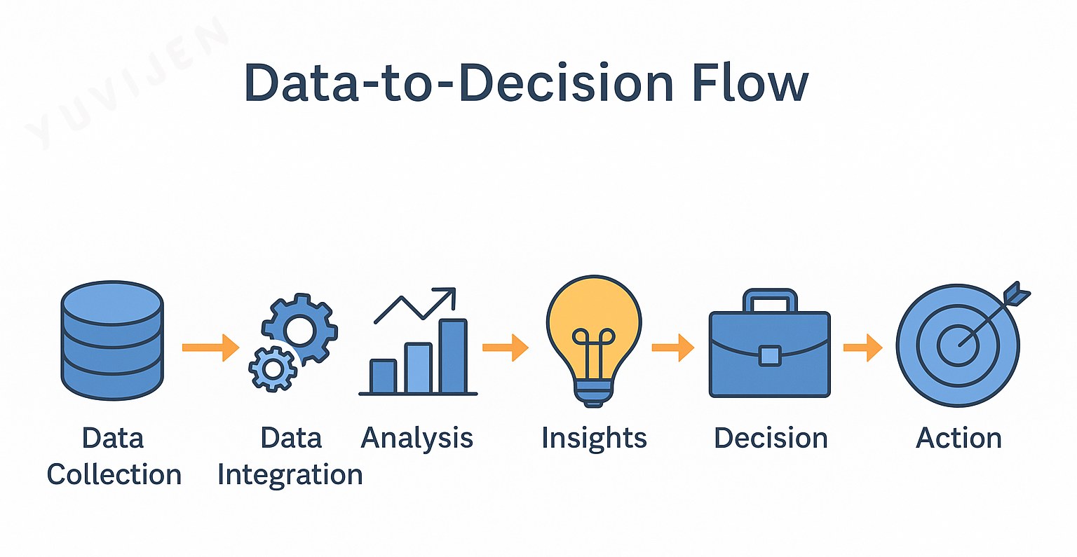
BI bridges the gap between raw data and strategic decisions, helping leaders answer:
- What happened?
- Why did it happen?
- What is likely to happen next?
- What actions should we take?
In a world overflowing with information — from customers, operations, and digital platforms — BI helps organizations transform data into clarity, direction, and measurable impact.
Business Intelligence (BI) refers to the use of technologies and processes that collect, analyze, and visualize business data for decision-making.
Through dashboards and reports, BI turns raw numbers into actionable insights that support both daily operations and long-term strategies.
Key Idea:
BI enables organizations to make informed, evidence-based decisions by simplifying complex data into meaningful patterns and trends.
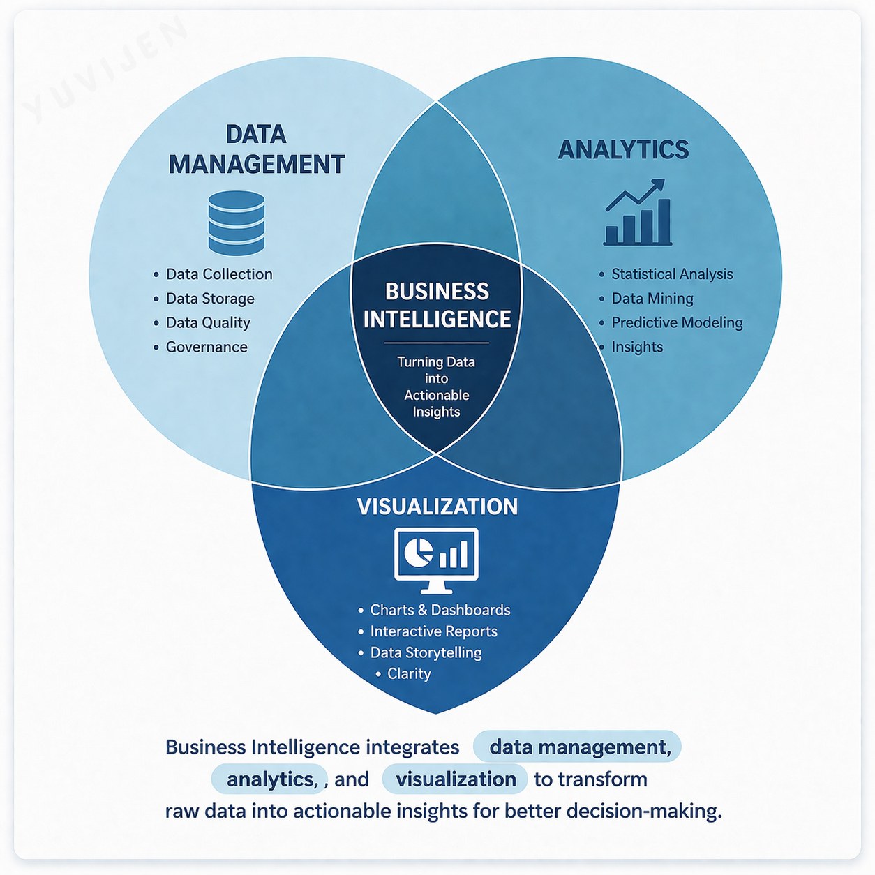
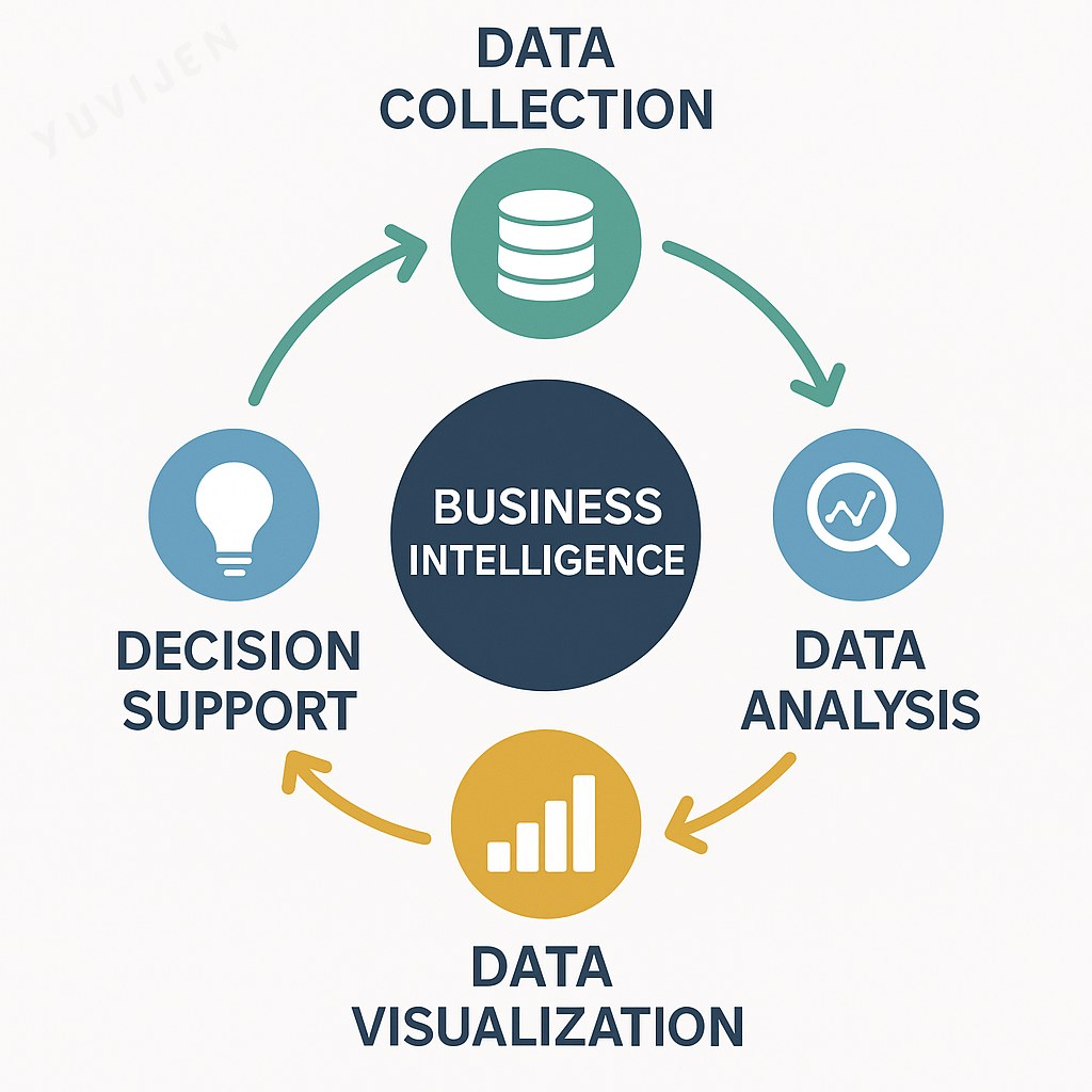
Components of Business Intelligence
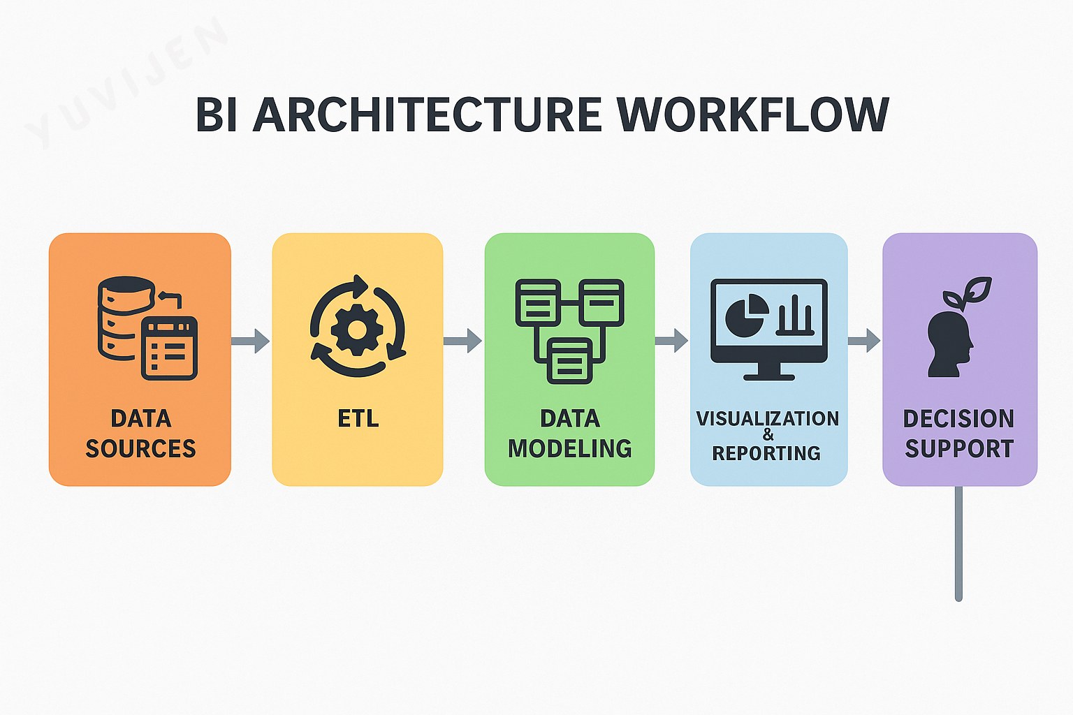
A BI system consists of several integrated components that work together to create insights:
-
Data Sources: Information from ERP, CRM, Excel, or cloud systems.
-
ETL (Extract, Transform, Load): Cleans and organizes data before analysis.
-
Data Modeling: Defines relationships and key metrics for analysis.
-
Visualization and Reporting: Builds dashboards using tools like Power BI.
- Decision Support: Provides insights for planning and performance monitoring.
Practical Note:
Effective BI depends on clean data and thoughtful visualization design.
Popular BI Tools and Techniques
BI tools and techniques allow users to collect, analyze, and present data effectively.
While each platform differs in features, all aim to help organizations make smarter, data-driven decisions.
Popular BI Tools
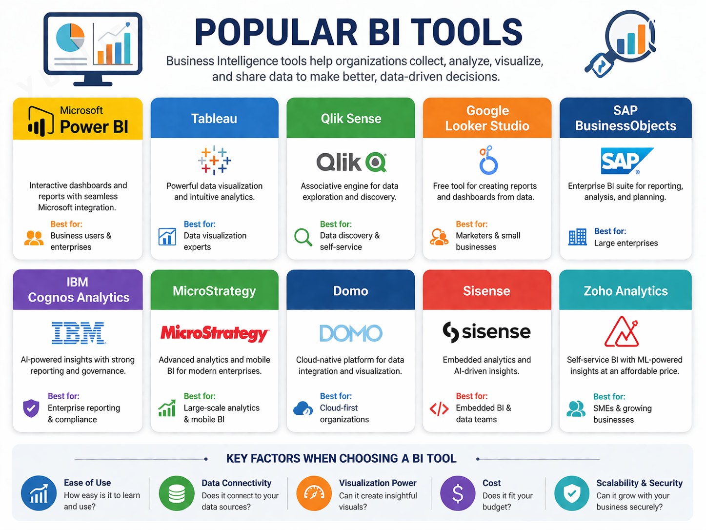
| 🧰 Tool | 💡 Description |
|---|---|
| 🟨 Microsoft Power BI | Connects multiple data sources and creates interactive visuals. |
| 📈 Tableau | Offers advanced, intuitive data visualization. |
| 🧩 Qlik Sense | Provides associative data modeling and self-service analytics. |
| 🤖 IBM Cognos Analytics | Delivers AI-assisted reports and insights. |
| ☁️ Google Looker (Looker Studio) | Cloud-based BI for real-time analytics. |
| 🔮 Oracle Analytics Cloud | Combines data visualization with predictive modeling. |
| 📊 SAS BI | Popular in finance, research, and healthcare for statistical analysis. |
Observation:
Among these, Power BI stands out for its user-friendly interface, affordability, and seamless Microsoft integration.
Common BI Techniques
| 🧠 Technique | 🎯 Purpose / Function |
|---|---|
| 🗂️ Data Warehousing | Centralizes and standardizes data from multiple systems. |
| 🔍 OLAP Analysis | Enables multidimensional analysis of data by time, region, or product. |
| 💎 Data Mining | Identifies hidden patterns, relationships, and trends in data. |
| 📊 KPI & Dashboarding | Tracks and visualizes key performance metrics in real time. |
| 📈 Predictive Analytics | Uses statistical and machine learning models to forecast outcomes. |
| 🧭 Self-Service BI | Allows non-technical users to create their own reports and dashboards. |
| 💬 Natural Language Query (NLQ) | Lets users ask questions in plain language (e.g., “Show monthly revenue”). |
Example:
In Power BI, Quick Insights and Q&A features simplify advanced analytics for all users.
Real-World Applications of Business Intelligence
🏬 Retail Analytics
Context: A large retailer such as Reliance Retail or Walmart manages millions of daily transactions across stores.
Challenge: Overstocking in low-demand regions and frequent stock-outs in high-demand areas.
Solution: Power BI dashboards integrated sales, inventory, and regional demand data using Power Query and DAX measures for forecasting.
Outcome: Inventory turnover improved by 20 %, logistics costs dropped, and stock visibility became real-time across branches.
💡 BI transformed supply chain planning from reactive to predictive.
🏥 Healthcare Analytics
Context: A multi-specialty hospital network struggled with patient delays and underutilized staff resources.
Challenge: Outpatient waiting times exceeded service benchmarks, leading to lower satisfaction scores.
Solution: Power BI dashboards consolidated appointment logs and doctor schedules. Drill-through visuals identified bottlenecks in patient flow.
Outcome: Waiting times reduced by 25 %, doctor utilization increased, and patient experience improved significantly.
💡 BI enabled data-driven healthcare operations for better capacity planning.
⚙️ Manufacturing Analytics
Context: A mid-sized manufacturing firm faced fluctuating profit margins due to variable input costs and inconsistent production efficiency.
Challenge: Lack of consolidated visibility across procurement, production, and financial systems.
Solution: Power BI integrated ERP data, cost centers, and supplier records. What-if parameter modeling helped simulate cost changes and margin impact.
Outcome: Procurement cycle time reduced, supplier performance improved, and profit margins increased by 10 %.
💡 BI turned financial and operational data into actionable performance insights.
👩💼 HR Analytics
Context: A large services organization was experiencing high employee turnover among mid-level professionals.
Challenge: Limited visibility into attrition drivers such as pay satisfaction, workload, and promotion wait time.
Solution: Power BI combined HRIS, payroll, and performance data using Power Query joins. Interactive dashboards tracked attrition by role, age, and tenure, while correlation visuals highlighted pay–retention links.
Outcome: Identified key turnover factors and redesigned compensation and engagement policies, reducing attrition by 15 % within two quarters.
💡 BI helped HR move from intuition-driven decisions to evidence-based talent strategies.
Data Visualization
Data Visualization is the graphical representation of information and data through visual elements such as charts, graphs, and dashboards.
It allows complex information to be communicated in an intuitive, accessible form that supports faster and more accurate understanding.
In modern analytics, visualization serves as the interface between data and decision-making.
While analytics uncovers insights, visualization makes them visible — helping users interpret numbers, spot trends, and communicate meaning clearly.
Effective visualization enables organizations to:
- Simplify complex analyses into meaningful visuals.
- Detect trends, correlations, and anomalies quickly.
- Facilitate real-time data exploration and interactivity.
- Strengthen data storytelling for business presentations.
- Improve decision-making by translating data into action-oriented insights.
Ultimately, data visualization transforms information into intelligence, bridging the technical analysis performed by systems with the strategic understanding required by decision-makers.
It is not just about displaying data — it’s about revealing meaning and guiding informed choices.
Types of Data Visualization
Depending on the nature of data and the insights required, various types of data visualizations are used in Business Intelligence (BI).
Each visualization type serves a unique purpose — helping analysts compare, interpret, and communicate data effectively.
Bar Charts
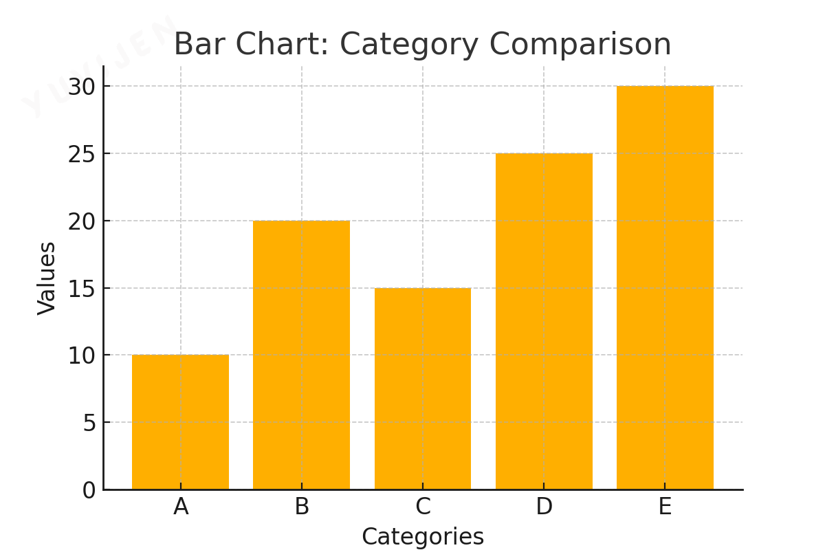
Bar charts are among the most commonly used visuals in data analysis.
They display data using rectangular bars where the height or length of each bar corresponds to the value it represents.
Bar charts are ideal for comparing different categories of data or showing changes over time.
Use Cases:
- Comparing sales performance across regions.
- Analyzing customer satisfaction scores.
- Displaying revenue growth by quarter.
Types of Bar Charts:
-
Vertical Bar Charts: Used for showing trends over time.
-
Horizontal Bar Charts: Effective for ranking and comparisons.
- Stacked Bar Charts: Show subcategory proportions within a main category.
Line Charts
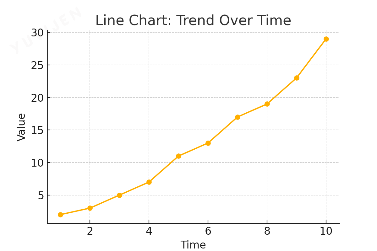
Line charts visualize data trends across continuous intervals, connecting data points with lines to illustrate movement or change.
They are ideal for showing growth patterns, fluctuations, or comparisons over time.
Use Cases:
- Monitoring stock market performance.
- Tracking website traffic over weeks or months.
- Analyzing seasonal temperature variations.
Key Benefits:
- Clearly reveals trends and future projections.
- Can compare multiple data series simultaneously.
Pie Charts
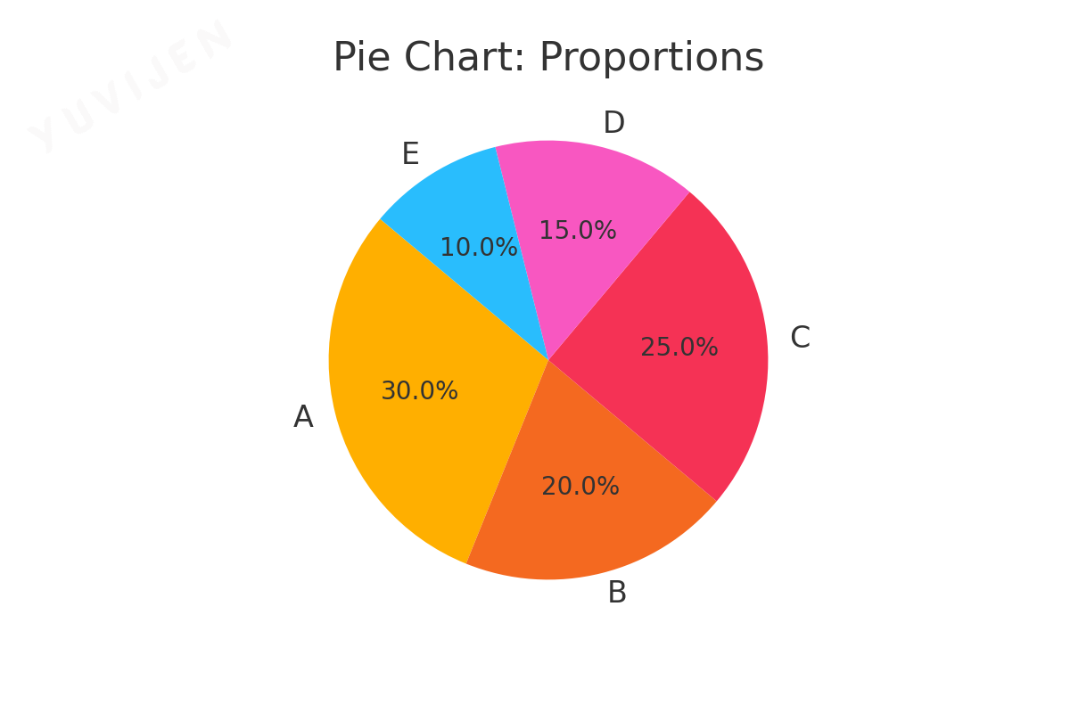
Pie charts represent parts of a whole using slices of a circular chart.
Each slice’s size is proportional to its contribution to the total.
They work best when comparing a limited number of categories.
Use Cases:
- Showing market share by company.
- Visualizing departmental budget allocation.
- Displaying customer distribution by demographic.
Limitations:
- Difficult to compare exact values.
- Becomes cluttered when many categories are displayed.
Heatmaps
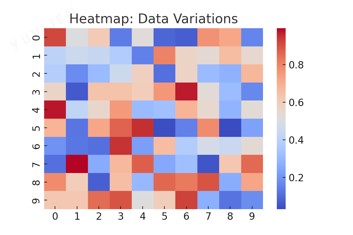
Heatmaps use color gradients to represent variations in data intensity, allowing users to spot patterns, correlations, and hotspots quickly.
They are especially effective for summarizing large datasets.
Use Cases:
- Tracking website activity and user interactions.
- Displaying correlation matrices in statistics.
- Monitoring real-time sales across multiple locations.
Key Benefits:
- Highlights high and low-value areas instantly.
- Excellent for showing density and variable relationships.
Scatter Plots
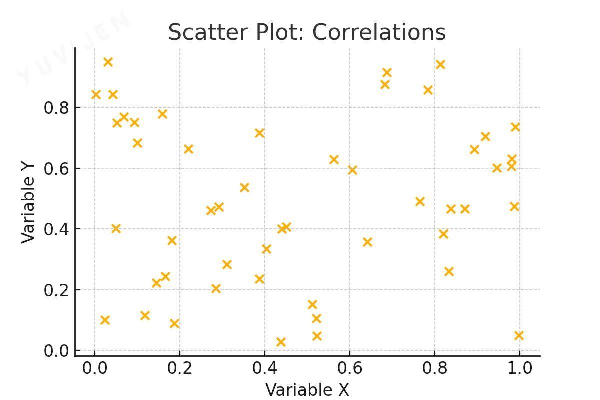
Scatter plots display relationships between two numerical variables, helping to identify correlations, clusters, and outliers.
Each point represents an observation plotted along the X and Y axes.
Use Cases:
- Comparing advertising spend vs. revenue.
- Analyzing customer demographics and purchase behavior.
- Exploring employee productivity vs. working hours.
Key Benefits:
- Identifies relationships and data clusters.
- Highlights outliers and anomalies effectively.
Geographical Maps
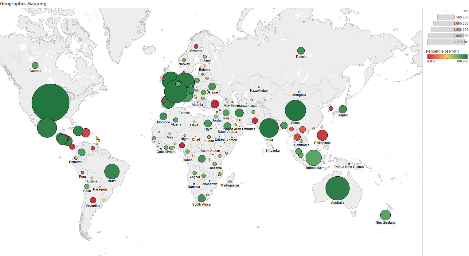
Geographical maps display data based on geographic or spatial locations, using color, shading, or symbols to represent metrics.
They allow users to visualize trends and patterns across regions.
Use Cases:
- Mapping population density or sales distribution.
- Analyzing regional performance across markets.
- Tracking the spread of diseases or events geographically.
Types of Geographical Maps:
-
Choropleth Maps: Use color gradients to represent values by region.
-
Bubble Maps: Represent data with bubble size variation.
- Heat Maps: Show data intensity across a map.